Member-only story
“Suddenly, Everything Changed!” — A Case Study on PhonePe’s Overwhelming Redesign

I remember standing in a crowded store, bag of groceries in one hand and my phone in the other. I needed to make a quick payment, so I opened the PhonePe app — just like I’d done countless times before. Except this time, the interface staring back at me wasn’t the PhonePe I knew. The once-familiar layout looked completely different, new banners had appeared, and for a split second, I questioned where to even tap.
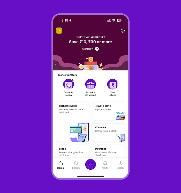
Welcome to the new PhonePe redesign: big, bold, and visually eye-catching, yet somehow jarring enough to make me pause mid-transaction. In this case study, I’ll walk you through my experience, explore why these changes felt overwhelming, and propose how redesigns can balance visual innovation with user familiarity.

1. The Moment of Disruption
Standing at the Counter
My first thought on seeing the updated interface was confusion — like stepping into your own home but finding all the furniture rearranged. It’s still your space, yet you have to look around to figure out what moved.
Immediate Reaction
“Wait, where’s the ‘Scan & Pay?’” I wondered. Even though scanning a QR code might still be roughly in the same spot, the new color schemes, banners, and icons made me feel as if everything had shifted.
Why It Matters
Muscle Memory: Apps we use daily become part of our subconscious habits. A sudden overhaul can cause friction, especially when you’re pressed for time or in a busy environment.

2. What Changed and What Didn’t
Visual Overhaul
- New Color Palette & Icons: The bright, modern color scheme immediately catches the eye, signaling a fresh brand identity.
- Promotional Banners: Instead of…

